Showing posts with label presenting. Show all posts

11/15/2014

to use or not to use

Do you use Prezi? Still not?! It has 40 million users and you are telling me you are not one of them?! What is your excuse?!

OK, I'll save you from the rest of the marketing bullshit. 


As an avid Prezilian and a dedicated educator, I have been evangelizing Prezi as a great educational tool. I gave a number of talks, seminars, and workshops, to introduce the benefits of this fairly young online software. Thanks to my researcher spirit, it also meant that I started surveying what people think about Prezi (gee, am I becoming a UX researcher?). The general opinion I encountered is strangely ambivalent. While most people are fascinated to see prezis, for their dynamism and spacial virtuosity, very few of them are comfortable when it comes to making them. In other words, a great number of people reach the point of user registration, with the intention to master this genial tool, but quite many of them end up entering their account once or twice only. More often than not, they quit after a couple of attempts. Simply speaking, it is because many people still find it too difficult and time-consuming, as compared to PowerPoint

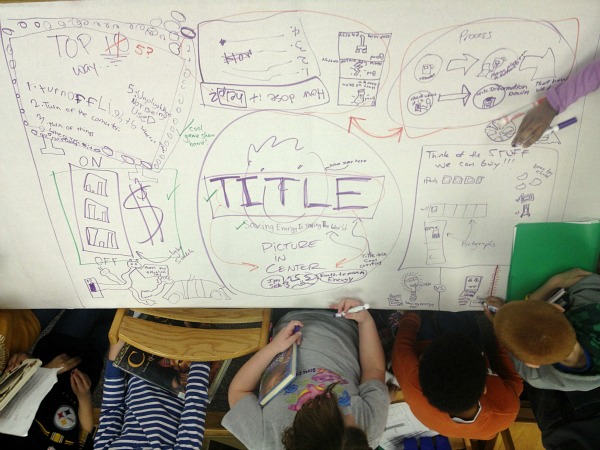
Bearing this in mind, I tried to find and propose solutions for an easier prezi production. This is how I bumped into templates, whose sole purpose is to make the software more user-friendly. I figured, their use must be very frequent, given that people generally struggle with all the freedom, as far as content and design are concerned. So, following this hypothesis of mine, I launched a research project and accepted to present it at a conference. This conference was just yesterday.


I must admit as a start, my hypothesis proved wrong. People don't seem to use templates; in fact, because of the arrangements of the page, most of the templates (let's say, 80 out of 90) remain hidden for most users (they would need to discover a button and make a click to find the majority of the templates). Also, the templates are restricted to certain themes (football, space travel, botanics, journey, etc.), or they are very schematic (imagine five circles and four arrows); this means that it is limited what topic they can be ideal for. Thirdly, people have a hard time customizing them. If, say, they only need four cicles for their four main topics, and the template contains five, they are stuck (no kidding).

To present this topic, of course, I also made a prezi, using one of the templates (called Uncharted Territory). Since most of the times I start my prezis from blank, having to use a template was a more or less uncharted territory for me. My impression about them is that, for a starter, they are useful (you can get inspiration and tips how to construct a prezi), but once you become more expert, they seem to be too limiting (both theme- and stucture-wise).

Below you can click through my prezi. Full screen recommended.

3/04/2014

prezi vs ppt

I already brought up Prezi a couple of times before, but since I feel many people are not familiar with it, at least as compared to, say, PowerPoint, I wanted to dedicate some posts to this topic. It is especially high time, because, you may have heard, Prezi made a deal with the US government, pushing the cloud based software to American schools. As the first post of this series, let me compare and contrast it with the rival presentation tool, PowerPoint.


Prezi is a tool for presentations, just like the above mentioned MS software, but it is quite different. Contrary to PPT, it is dynamic and spatial, not static and linear. Prezi has less limitations and restrictions, offering an unlimited canvas as a starting point, with which you do (almost) whatever you want to. PowerPoint, however, operates with slides, samples, and fixed constructions. Both have disadvantages, of course. If you don't have ideas, because you are a beginner or lack time, you will be lost in the infinite space of Prezi. Nevertheless, if you want to present visual structures and complex relationships, you will feel the world of PowerPoint like a cage. Lately, I find Prezi more and more inevitable for my work, may that be creative, academic, or educational.  

At the same time, we can witness a growing trend that using Prezi is cool. It is rare, however, that presenters use it in an effective way. If it is not the zooming function that is misused, then it is its very essence that is misunderstood. Now let me point out one way of mistreating this wonderful but not easy tool.

Many people get scared when they realize how much more time it takes to put together a good Prezi than making nice PPT slides (in fact, good visuals take a lot of time, whatever you make them with). So, what they do is that they just copy their PowerPoint slides into Prezi (as there is such an option in Prezi). Or, if not that, they use Prezi completely as if it was PowerPoint. In the end, you have 10-15 slides on the infinite canvas. Presentational suicide.

Here is a prezi I made when I wanted to show a group how not to use it. The original presentation was a relatively nice PPT. The prezi just sucks.


After the don't-s, next time we'll take a look at the do-s of making a prezi.

2/07/2014

see me

I've been teaching and analyzing presentations for years. Part of my routine is that I watch (and make my students watch) TED talks. Of course I have my favorites but I also test them with my students. A lot of people found Sir Ken Robinson hilarious and inspirational. Some, however, felt it was too much of a stand-up comedy. Also a large number of people gave positive feedback about Steve Jobs's Stanford Commencement Speech, or in more popular terms, on his How to Live Before You Die talk. Nevertheless, some critiqued that he was not being authentic and seems just like selling something. Simon Sinek's talk on the Golden Circle also received applause, but to the European ear his style seemed too manipulative in a number of cases. 

There was one speech only -- which by chance has been my favorite from the start -- that gained appreciation from everyone. And that was a presentation from a (for me) unknown Indian guy who charmed his audience not only with his simple, clear, and adorable message but also with his personality which he allowed to shine through every second of the talk (or rather, story-telling).


"Within infinite myths lie the truth. Who sees it all? Varuna has but a 1,000 eyes. Indra a 100. 
You and I only 2."

1/17/2014

what a decade

A week ago I posted an infographic summary of the past and (possible) future of education. The image suggested that education changed and will change drastically, thanks to the rapid progress of technology. Teachers have to adjust to and make use of the advancements, not only to catch up with the technical knowledge and interests of their students but also to enhance the learning process. The tools technology provide us with (can) make classes more efficient if they are used consciously. 

Take presentations for example. It caught me as a surprise when I peeked back how my talks looked like during my academic years -- which were not a long time ago -- and how I do them nowadays. The other day I bumped into a poster I had made for my presentation on Space Race, no later than in 2004. My professor said, after my performance, that in the history of his teaching at the university, this was the best presentation he had ever seen. And partly, it had to do with my visuals. Check them out for yourselves:


On a large piece of paper (size A2), I placed the visual summary of the 6 main steps in the Space Race and my talk, to function as a timeline for the events. I only included the most relevant data, which were dates and names, putting the most stress on visual clarity. Some important pictures (like that of Sputnik and Yuri Gagarin, and the photo of the back of the Moon taken my Apollo 8 and Neil Armstrong's famous picture on the Moon) were accompanied by the national flags of "who came first." Quite clear -- but minimalistic (for the 21st century).

Just as a joke, I decided to make new visuals for the very same talk, to compare and contrast how I would do it today. And also to reveal what a giant leap technology made in just a decade. Back in 2004 my paper poster was unique. Today my prezi, a much more dynamic and spectacular visual support, would be appreciated but far from being exceptional. 


Of course, we should note that a presentation, or a class, doesn't depend solely on the looks but on the balance of content and looks (which our new age seems pretty often to be forgetting).

11/02/2013

from mentor mob to lesson paths

As the third useful site, let's see what LessonPaths (ex-MentorMob, http://www.lessonpaths.com/) can do for us. Like Pinterest and Scoop.it!, LessonPaths helps you gather and share online content into themed folders. What is more here, you can edit them into a playlist. After each step, let's say, track, you can pose a test question, to check if your students got the point, or simply to poke and entertain them before the next assignment. 


I put together a selection of talks for an academic course on presentation skills, but business learners were also interested in going through a public speech development. Even if you are neither, I bet you'll profit from giving it a go. Let educator Ken Robinson, entrepreneur Steve Jobs, and "magic pixie" Brene Brown take you on a journey of inspiration!

10/10/2013

frameworks

How do you start a class? First of all, you introduce yourself and encourage the group members to introduce themselves too. Since this is necessary but often quite awkward, exactly because it is perceived as a must, it is best to put it in some unusual frame so you make them relax and forget about their uneasiness. 

Then, if it's not a formal (academic) class, which was announced and put together months before, the specific goals and the specific needs of the specific group members are fuzzy. Of course, they hired you to develop their language use or presentation skills or prepare them for a job or a trip, and so on, and you may even know an approximate level (say, A2 or B2 or C1, and so on). But before meeting the specific participants, you can only think in stereotypes and assumptions. What their strengths and weaknesses are, what they like and dislike, what experiences and frustrations they bring to class can largely influence how you need to plan the classes to be effective for them. And the earlier you get clear about these, the better you all will manage.

So, what I did with some of my business classes is that I made it clear on the first class that it is up to all of us how we organize the course. I shared the responsibility, thus trying to motivate them to take part in the class and in the learning process more actively (too often do I experience that learners like to consider themselves as customers and learning as a service, instead of realizing what it is: sweaty work).


After we discussed, based on the triggers in the presentation, what they wanted from the classes, and what rules we all keep, I filled the board with what we agreed on and sent them the outcome. Like a contract. "These are the frames we set together." Usually it is quite effective and can be the basis of mutual respect and trust.

9/21/2013

authentic experience

These days English has a special significance and a privileged position. It is indispensable to be able to use it if you want to go see the world beyond your village. Most of the learners are aware of this, but every once in a while it is worth reminding them of the benefits these efforts will bring them.

A couple of months ago I spent a short week in Dublin, Ireland, and I was amazed by the experience. I had never really looked forward to seeing Ireland, because of the weather, the cold attitude that I associated with the British and their neighbors, and the lack of any knowledge about the country except for Michael Flatley (whom I didn't fancy). In short, Ireland was somehow out of my sight. And it's a shame. Wonderful country, wonderful people! And I must add, wonderful accent!

Driven by my excitement, I put together a prezi to share the experience with my students -- and people around me -- and spread the word: not only Paris but also Dublin "is worth a mass." The viewers agreed and went to pray (for cheap air tickets).

9/07/2013

prezume

The first couple of classes are about getting to know each other. Whether it is a one-on-one class or a group session, it is my duty to take the lead. In most cases I start with this prezi.


(You liked my cat, didn't you?)

Why do I use a prezi?

Firstly, some of my students are not necessarily strong at oral comprehension. If they have visuals to support what I say, that makes a big difference. 

Secondly, it breaks the ice if you introduce something funny and visually compelling, which also shows you take your job and them seriously. I frequently get compliments, not necessarily because it was the most beautifully designed prezi, but mainly because people rarely make efforts where I did.

Thirdly, I love giving trainings on presentation skills, because I believe whoever interacts with people, which is the majority of us, needs these skills and we are rarely confident in them. I do end up teaching presentation skills to many of my students at some point of the course, and I bet this intro has something to do with it.